
If you’ve ever wondered why you feel relaxed and comfortable in one space and tense or angry in another, it may have to do with the color of the room you’re in. Color actually influences our emotions and perceptions on an unconscious level – as any good marketer knows.
Next time you’re at a fast food restaurant, take note of the color scheme. Most of them will be red, orange or yellow, which are colors that generally make people feel energized, happy and in a hurry.

Coffee shops and bistros will often use brown, green, and other earthy tones, as these colors make people feel relaxed and comfortable – and because they are found in nature, these hues represent healthy eating.
Speaking of eating, color psychology works on food, too. Consider this: would you eat green bread? How about orange milk? Additionally, the packaging of food is well planned to ensure that it clearly represents the taste of the food itself. A bag of frozen peas that is predominantly purple and yellow isn’t that appetizing.
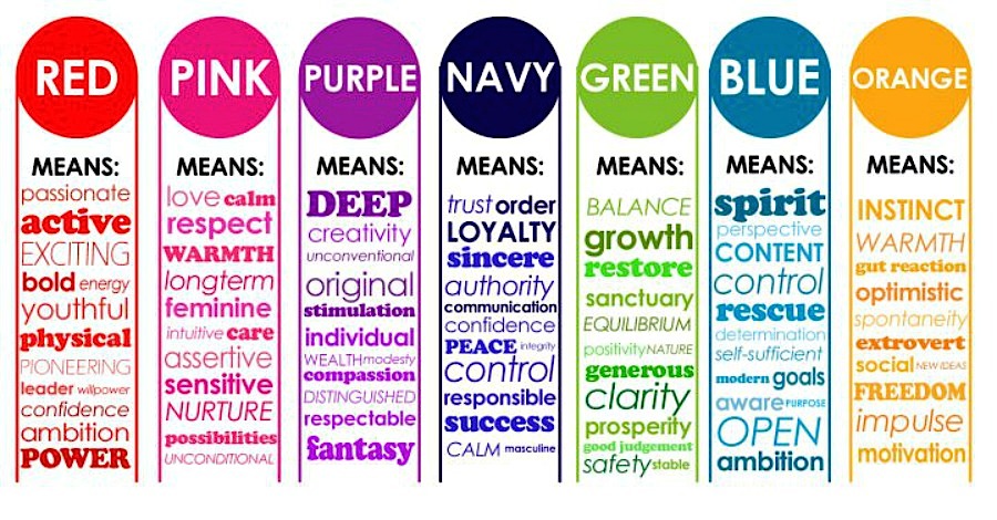
Here’s a handy at-a-glance chart of what emotions the major colors trigger:
Color Tips for Each Room in Your House
Knowing what colors enhance which emotions is very helpful when decorating your house. You can create a very specific mood for each room simply by the color you paint the walls, the color of the furniture, or even by enhancing the room with throw pillows, a blanket, plants or a picture on the wall.

Kitchen
- Yellow is a good color for the kitchen because it’s cheerful, energizes you in a grounded way, and can help increase metabolism. When you think yellow, you think warm, happy sunshine (and maybe lemonade, too!).
- Gray, as long as it is a warm hue, not a cool steel gray, is a great choice because it is simple yet elegant and goes with any other color. If you paint your kitchen gray, be sure to accentuate it with other warm colors.
- Green is a popular color for bistros and cafes, so it makes sense to use it in your kitchen, too. As we mentioned above, this is the color of nature and can make you feel grounded, relaxed and naturally energized. We suggest staying away from lime green or a dull pea green.

Living Room
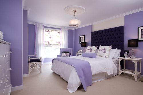
- Lavender is a beautiful, calming shade of purple and is therefore very well-suited for the living room. While a darker, richer purple tends to be more stimulating, lavender or lilac promote serenity and mindfulness. Try adding a few darker purple accents, like cushions or paintings, to an otherwise lilac room.
- Blue is calm and cool, much like the sky on a beautiful spring day or the waveless ocean. Because of its tendency to promote a more cool, as opposed to warm, atmosphere, choose either a light pastel blue or a darker blue (though not as dark as navy).
- Green can also work well in the living room, provided it is a darker, forest green with plenty of lighter accents, like white crown molding or curtains.

Dining Room
- Red stimulates appetite (see fast food restaurants above), which can make it a good match for a dining room, though not everyone will get onboard with this color choice. Red can be excitable and encourage high-energy moods, so choose your shade of red well. As with many bold or dark colors, use plenty of lighter accents in the way of cushions, chairs, flowers, paintings, and trim.
- Orange is another color that stimulates the appetite and is therefore suitable for the dining room. It promotes a feeling of warmth, vibrancy and wholesomeness.

Bedroom
- Green can be a good choice for the bedroom and, depending on the person whose room it is, you can go darker, lighter or brighter. A teenager may want the energizing effects of lime green, while an adult might prefer a relaxing and harmonious forest green. All shades of green exist in nature, so you really can’t go wrong with this color.
- Blue is one of the most popular colors for the bedroom because it’s calming and represents trustworthiness and strength.
- Lavender calms the nerves and promotes relaxation, and is the most popular color – and fragrance – for this reason. In fact, according to the University of Maryland Medical Center, the lavender herb is frequently “used as a remedy for a range of ailments from insomnia and anxiety to depression and fatigue. Research has confirmed that lavender produces calming, soothing, and sedative effects when its scent is inhaled.”
Brought to you by Signature Exteriors roofing contractor in St. Charles, MO!